What is response navbar?
A responsive navbar is a navigation menu on a website that automatically adjusts and adapts its layout and appearance based on the screen size and device being used. It is designed to provide an optimal user experience, ensuring that the navigation remains easily accessible and usable on different devices, such as desktops, tablets, and mobile phones. The responsive navbar utilizes CSS and JavaScript techniques to dynamically rearrange and resize the menu items, making it easier for users to navigate the website regardless of the device they are using.
Method of responsive navbar:
- CSS Media Queries: Utilize CSS media queries to define different styles and layout rules for different screen sizes. Adjust the navbar's appearance and behavior based on breakpoints to ensure responsiveness.
- Flexbox: Utilize CSS Flexbox properties to create a flexible and responsive navbar layout. Flexbox allows you to easily distribute and align navbar items, making them adapt to different screen sizes.
- CSS Grid: Implement CSS Grid to create a responsive grid-based navbar. CSS Grid enables you to create multiple columns and rows, allowing you to organize navbar elements effectively and responsively.
- JavaScript DOM Manipulation: Use JavaScript to dynamically manipulate the navbar elements based on the screen size. You can add event listeners, modify CSS classes, or change styles to make the navbar responsive.
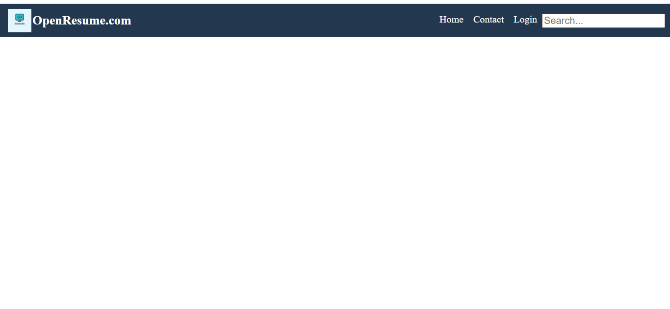
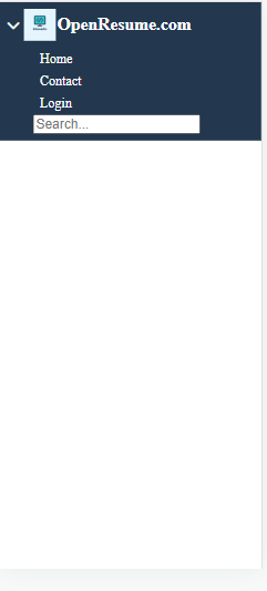
In this article, we will create a responsive navbar using CSS and JavaScript. CSS Flexbox and JavaScript were used to create a responsive navbar. Flexbox will be used for responsiveness, and JavaScript will be used for handling click events on the hamburger menu.
Output:
Getting start from html:
Here use fontawesome is used for icons.
<!DOCTYPE html>
<html lang="en">

<head>
	<meta charset="UTF-8">
	<meta http-equiv="X-UA-Compatible" content="IE=edge">
	<meta name="viewport" content="width=device-width, initial-scale=1.0">
	<link rel="stylesheet" href="https://cdnjs.cloudflare.com/ajax/libs/font-awesome/6.4.0/css/all.min.css"
		integrity="sha512-iecdLmaskl7CVkqkXNQ/ZH/XLlvWZOJyj7Yy7tcenmpD1ypASozpmT/E0iPtmFIB46ZmdtAc9eNBvH0H/ZpiBw=="
		crossorigin="anonymous" referrerpolicy="no-referrer" />
	<title>Responsive Navbar</title>

</head>

<body>
	<header>
		<div class="navbar">
			<div class="header-button">
				<label for="toggle_input" id="toggle_label"><i class="fa-solid fa-bars"></i></label>
                <input type="checkbox" id="toggle_input" value="false" onchange="toggle_button()">
                <img src="favicon.ico" alt="">
				<h1>OpenResume.com</h1>
			</div>
			<ul id="nav_ul">
				<li><a href="#">Home</a></li>
				<li><a href="#">Contact</a></li>
				<li><a href="#">Login</a></li>
                <form>
                    <input type="text" placeholder="Search..." name="search">
                </form>
			</ul>

		</div>
	</header>


</body>

</html>
*{
margin: 0px;
box-sizing: border-box;
font-size: 20px;
}
header {
padding: 0.5rem;
background: #23384E;
}
header .navbar {
display: flex;
justify-content: space-between;
align-items: center;
}
header .navbar .header-button {
display: flex;
align-items: center;
}
header .navbar h1 {
color: white;
font-size: 1.3rem;
padding-left: 0.1rem;
}
header .navbar img {
color: white;
font-size: 1.3rem;
padding-left: 0.3rem;
}
#nav_ul {
display: flex;
list-style: none;
}
header .navbar label {
color: white;
display: none;
}
.header-button input {
display: none;
}
#nav_ul a {
text-decoration: none;
color: white;
padding: 0.5rem;
}
#nav_ul form {
margin-top: 0.3rem;
}
@media (max-width: 992px) {
    header .navbar {
        flex-direction: column;
        align-items: flex-start;
    }

    #nav_ul {
        flex-direction: column;
        padding-top: 0.3rem;
        display: none;
    }

    #nav_ul li {
        padding-top: 0.5rem;
    }

    header .navbar label {
        display: block;
    }
}
function toggle_button() {
var checkbox = document.getElementById("toggle_input").checked
console.log(checkbox)
if (checkbox == true) {
document.getElementById("toggle_label").innerHTML = '<i class="fa-solid fa-chevron-down"></i>'
document.getElementById("nav_ul").style.display = "flex"
} else {
document.getElementById("toggle_label").innerHTML = '<i class="fa-solid fa-bars"></i>'
document.getElementById("nav_ul").style.display = "none"
}
}window.onresize = (event) => {
if (document.getElementsByTagName("body")[0].clientWidth > 992) {
document.getElementById("toggle_input").checked = false
document.getElementById("toggle_label").innerHTML = '<i class="fa-solid fa-bars"></i>'
document.getElementById("nav_ul").style.display = "flex"
}
else {
toggle_button()
}
}